The Ultimate Guide to Project Management Charts: Tools, Uses & Examples | Learnerskart
-
November 27, 2025
Project management is all about clarity, control, and communication. Whether you’re planning timelines, tracking Agile sprints, managing risks, or presenting project updates, the right chart can transform complex data into clear, actionable insights.
This guide covers every major project management chart, organized by purpose—so you know exactly when and why to use each chart. Perfect for project managers, Scrum masters, team leads, and business analysts.
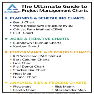
🔵 1. Planning & Scheduling Charts
These charts help you plan, sequence, and visualize project timelines from start to finish.
🟦 Gantt Chart
One of the most widely used charts. Helps visualize:
-
Start & end dates
-
Activity sequences
-
Dependencies
-
Milestones
-
Delays and overlaps
Ideal for waterfall and hybrid projects.
🔷 Work Breakdown Structure (WBS)
Breaks project scope into smaller, manageable work packages.
Ensures everyone understands what needs to be delivered.
🔶 Critical Path Method (CPM)
Identifies:
-
The longest path of activities
-
Tasks with zero float
-
Bottlenecks affecting project duration
Essential for schedule optimization.
🔹 PERT Chart
Useful when timelines are uncertain.
Uses optimistic, pessimistic, and most-likely durations to estimate activity timelines.
🟢 2. Agile & Iterative Charts
Perfect for Scrum teams and Agile delivery models.
🟩 Burndown / Burnup Charts
Track sprint performance:
-
Burndown: Work remaining
-
Burnup: Work completed
Helps detect scope creep early.
🟦 Kanban Board
Visual representation of workflow stages, such as:
-
To Do
-
In Progress
-
Completed
Highlights bottlenecks and WIP limits.
🟠 3. Performance & Reporting Charts
Helpful for status updates, dashboards, and retrospective analysis.
🟧 KPI Scorecard (RAG Status)
A simple Red-Amber-Green color-coded view of:
-
Schedule health
-
Cost status
-
Risks
-
Quality metrics
🟪 Bar / Column Charts
Used for:
-
Budget vs actuals
-
Planned vs executed efforts
-
Defect severity comparisons
🟦 Line Chart
Shows trends over time:
-
Costs
-
Defects
-
Productivity
-
System availability
🟨 Pie / Donut Chart
Represents percentage-based splits such as:
-
Resource allocation
-
Budget distribution
-
Issue categories
🟥 Stacked Bar Chart
Shows contribution of individual segments:
-
Sprint story points by team
-
Effort distribution
🟫 Heat Map
Highlights:
-
Priority levels
-
Workload intensities
-
Risk hotspots
⬇️ Funnel Chart
Used for:
-
Defect lifecycle
-
Sales or approval pipeline
-
Change request flow
🟡 4. Analysis, Risk & Process Charts
Used for RCA, process optimization, and risk planning.
🔸 Flowchart
Perfect for mapping:
-
Business processes
-
Testing workflows
-
Approval cycles
Enhances clarity and process efficiency.
🔷 Pareto Chart (80/20 Rule)
Identifies the top contributors to problems:
80% of issues usually originate from 20% of causes.
🔹 Histogram
Shows data distribution to support RCA, QA analysis, and trend understanding.
🟥 Risk Matrix
Plots risks based on:
-
Probability
-
Impact
Helps prioritize mitigation planning.
🟦 Stakeholder Map
Categorizes stakeholders by:
-
Influence
-
Interest
Helps design targeted communication strategies.
🎯 Final Thoughts
Project management charts are powerful tools that simplify decision-making, improve collaboration, and bring transparency to projects of any size. Whether you’re working in Agile, Waterfall, or Hybrid models, choosing the right chart can significantly enhance your project outcomes.
If you master these charts, you master the language of effective project management.
✅ Created by LearnersKart
Your trusted partner for:
-
PMP Certification
-
CAPM, PMI-ACP, PgMP
-
Lean Six Sigma
-
CBAP, ECBA
-
Prince2
-
ITIL
-
Digital Marketing & more
🌐 Visit: www.learnerskart.com | 📧 Email: info@learnerskart.com
✔️ Follow us for more project management tips & career insights! https://lnkd.in/gYB4Dw4K
Tags:
You May Also Like

-
Feb 16, 2026
If you’re planning to apply for the PMP certification in 2026, one important question comes first: “Am I really eligible...

-
Feb 13, 2026
In today’s fast-paced business environment, choosing the right project delivery approach can determine whether your project succeeds or struggles. Organisations...

-
Feb 10, 2026
In today’s fast-paced and increasingly complex business environment, organisations are no longer managing just one or two initiatives at a...

-
Feb 9, 2026
In project management, confusion over who does what and who makes the final decision is one of the biggest reasons...
Sign up to receive our latest updates
Company
Support
Service Offerings
Special Offers
Get in touch
India
Call us directly?
+91-984-459-1589
Address
Learnerskart Solutions Pvt Ltd
4th floor, No: 207/189, 9th Main Rd, 6th Sector,
HSR Layout, Bengaluru, Karnataka 560102
info@learnerskart.com
USA
Call us directly?
+1 (307)-998-3816
Address
Learnerskart Americas LLC
30 N Gould St Ste R
Sheridan, WY 82801
info@learnerskart.com
Quick Contact
Trending Categories
Disclaimer
“PMI®”, “PMBOK®”, “PMP®”, “CAPM®” and “PMI-ACP®” are registered marks of the Project Management Institute, Inc.
ITIL® and PRINCE2® are registered trade marks of AXELOS Limited, used under permission of AXELOS Limited. All rights reserved.
“CSM”, “CST” are Registered Trade Marks of The Scrum Alliance, USA.